Bumble has been known for ages as the dating app where women message first.
And that seemed to work for a while.
But with complaints flooding in from their female users, upset about lack of quality, improper matches, and the dating bro who swipes right on everyone hoping for casual dates on an app backed by intentional daters, it’s safe to say that users were burnt out and ready for a change.
So, what’s coming? What changes can you expect within the app, and what does that mean for your online dating experience as a user?
Here’s what we know so far.
#1. There’s a new look
Instead of the sunshine yellow, the new Bumble is more clinical. It feels like you’ve walked into a doctor’s office, but virtually, for online dating. It’s grey and lacks a bit of vibrance, but let’s not be surface-level.
This change comes after a survey in which 75% of surveyed women cited the importance of a dating app’s look and feel to their overall experience. But grey? Bumble, come on.
We’re with Reddit users on this one; a dark mode would make sense.
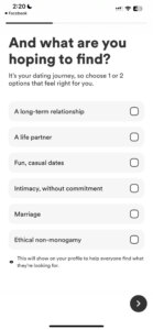
#2. There are new ways to define what you’re “looking for”
Before the update, your “looking for” options were: Relationship, Something casual, Marriage, or Not sure yet. Now, the options are:
- Long-term relationship
- A life partner
- Fun, casual dates
- Intimacy, without commitment
- Marriage
- Ethical non-monogamy
While this seems more inclusive, it’s hard to understand what vibe Bumble will take on. Will Bumble be the new Tinder? Here’s what the Reddit crowd has to say:
Usually, when apps lean too far into the casual atmosphere, they’re quickly labeled “hookup” apps. So, while the jury is still out on this one, we predict that the intentional dating app users will make a beeline (no pun intended, Bumble) to Hinge or a more relationship-first app.
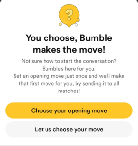
#3. The new “Opening Moves” feature lets men sort of message first
As previously stated, Bumble is the app where women message first. After the update, it’s now the app where women set an “Opening Moves” question and answer, men respond with their answers, and then women match them back.
We think the new Bumble CEO, Lidiane Jones, made this change to stop the constant “hey” or “hi” first messages that women were sending out to matches as if they were mass-emailing their email list. It turns out that most women don’t actually want to message first, so they’ll send the basic greeting message and wait for men to respond with an engaging first message. Hence, the new Opening Moves feature.
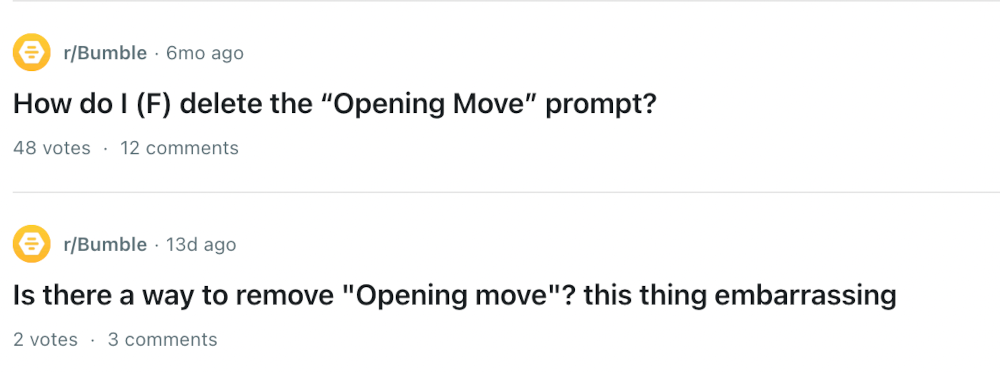
We can see the vision, but it doesn’t work, and people so far are hating it.
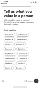
#4. You can tell people what you value in a partner
Rather than just reading a bio and getting a feel for people in messages or IRL, you now have the option to define what values are important to you in a potential partner.
Some people love this feature, claiming it helps narrow down topic areas in the limited messages they’ll be exchanging, allowing daters to save their valuable prompt space for other prompts instead.
Others dislike this feature because they want their matches to be themselves without knowing they want someone caring, funny, and family-oriented. Since people can be whomever they want to be online (and, frankly, offline as well), some singles don’t want to give out their non-negotiable wants immediately.
Keep in mind: A different version of you exists in the minds of every single person you meet. It’s vitally important to meet face-to-face to decide if this person is your cup of tea or your shot of whiskey. Feel it out, but don’t discredit a possible match because they didn’t put the same values you did.
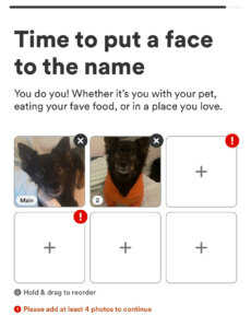
#5. You must upload at least four photos instead of two
Four photos minimum here, people.
Honestly, we love that. Those are two additional chances for us to understand you better from your pictures.
If you’re not a photo fan, don’t panic. Here are the essential photos you must have on your profile to make an impression.
But don’t forget to pass them by Photofeeler first. Run a free dating photo test now!
Give people what they want (this wasn’t what they wanted)
Outside of the new UX changes, ways to define (or add ambiguity to) what you’re looking for, men messaging first (kind of), and the additional ways to set what values matter to you, it doesn’t feel like Bumble improved user’s experience or feeling towards the app at all.
Reddit users wanted:
- Better distance filtering.

- To be left out of someone’s travel romance.

- To dodge low-effort people without bios.

- To skip being a part of a random threesome.

Amongst many other things.
So, with that all being said, we’ll see you on Hinge for dating and Tinder for hookups.
You can’t force an app to give you quality matches, but you can certainly attract them with a Photofeeler-vetted profile pic. Test a photo today, or give other users feedback on their photos for a free karma photo test!
